UI components
22 entriesComponent libraries, blocks and primitives.
22 entries
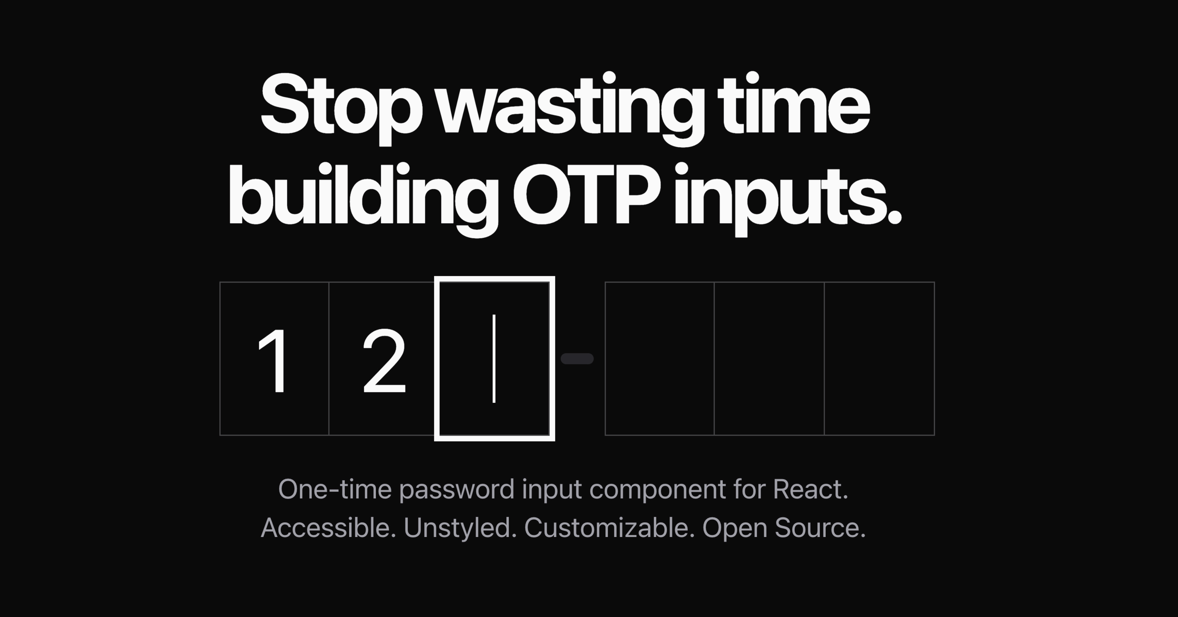
Unstyled, accessible one-time-passcode input for React.
Accessible React components you copy into your project, built on Tailwind CSS.
Free map components for React and shadcn with a one-command setup.
Animated React components installable through the shadcn CLI.
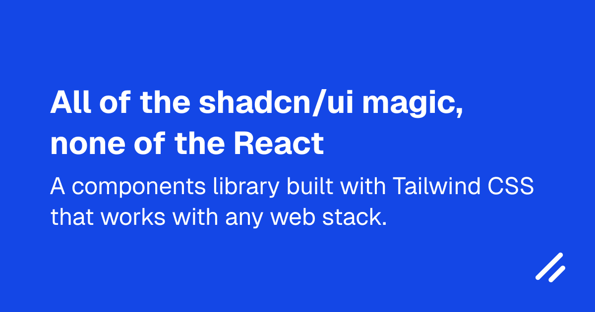
shadcn/ui-style components on Tailwind CSS that work without React.
A toolkit for building your own Astro component library, not for shipping one.
Primitives for AI-native interfaces: loading states, thinking traces and streaming text.
Component library built on Base UI, with 55 components.
Hand-drawn UI controls with a fresh pen sketch on every mount.
A system and component set with fluid hover, motion and surfaces.
Copy-paste UI blocks and templates installable through the shadcn CLI.
Components whose behaviour is complete down to the frame; you supply the style.
Cloudflare's component library: about 50 components, charts and a CLI.
Lightweight library of loading indicators for React.
Markdown-friendly MDX components: callouts, steps, terminals and charts.
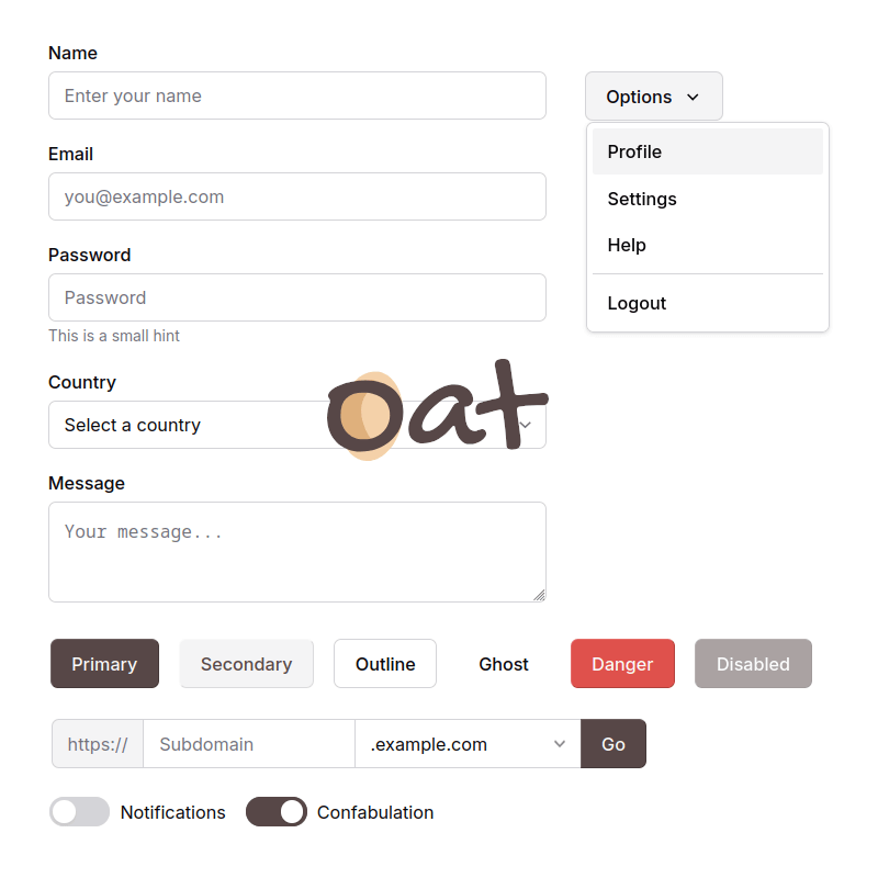
Ultra-light semantic HTML and CSS UI library with zero dependencies.
Animated, interactive React components built with Tailwind CSS and Motion.
A free animated component library: loaders, backgrounds and effects.
Design-forward shadcn/ui components and blocks with MCP support.
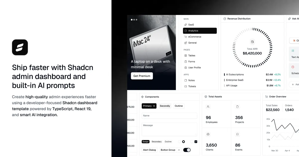
Admin dashboard UI blocks and components with a CLI and MCP.
A component library with charts, marquee, QR codes and MCP components.
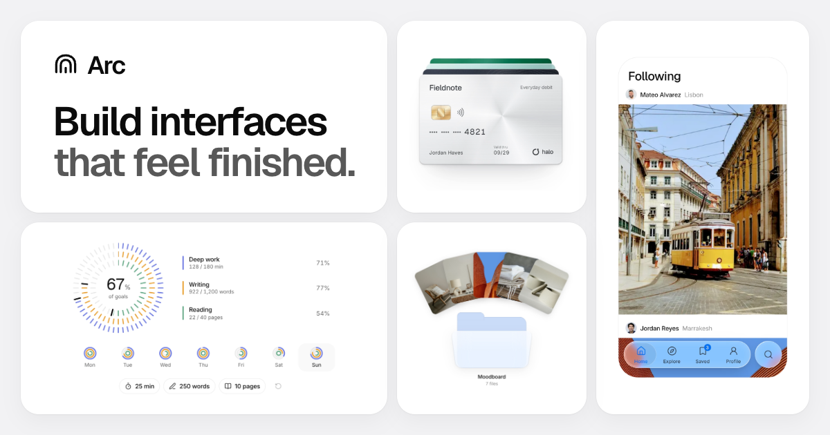
Components for the small details that make an interface feel trustworthy.





No entries match.